I didn't mean to postthe one with the mirrorimage actually - that was simply a test to see if I could do something cool with text, and as you can read from my previous post:
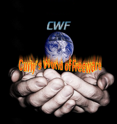
But I made the hands banner for a customer of my webdesign-company, and she decided to go another way afterwards - due to the bleuprint I made for her for her webpage. She did like the logo though, and so do I, so that is why I thought of using it this way here.I dont do that well with cool text.
It symbolises the right idea - it is a world passed to you for free. So what better logo for CurlysWorldofFreeware? But who has any good ideas about how to do some cool text?
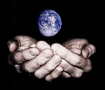
Also the banner idea needs to be adapted to the spaces it should fill so...